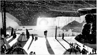
 This is the promo that airs on BBC
http://www.youtube.com/watch?v=9JAqz-Kn2KE
This is the firm that created the promo for BBC
http://www.studioaka.com/
This is a short promo for the Winter Olympics that is playing on BBC. This promo was done by Studios AKA, which is a London based firm.
The story of this animation is a good one because it focuses on one character, Inuit, who spots a glow in the side of a mountain. The Inuit then ventures down the hill transitioning from sport to sport. The Inuit's main goal is to get to the end where the glow is which is the main focus. This represents the peak of all Olympic sports wich is a medal. Then in the end gives the audience a place and time of when the Olympics begin so that they can tune in and watch them.
The color of this animation is simple, it uses whites and blacks to tell this story with different shades. The different shades helps to represent the three-dimensional forms. If the aniamtion had color in it the entire animation would be completely different. The animation would have a different sense and maybe not be as dramatic as it is now, which would not draw as much people.
Another part of this animation that is good is the sound that is used. The sound that is used just begins with wind then transitions into dramatic music. Since this is the animation is for promoting the Olympics so the music will get people pumped up and wanting to watch them.
The effects that are used for this animation are interesting because it does focus on the one character and his journey from the top of the mountain to the bottom. The visual appeal to this is that the characters and the wolves are simple they are not complex and difficult to follow. The snow underneath the Inuit when he is snowboarding and skiing comes up which gives the sense of the Inuit actually being on snow. Then when the Inuit is lugging down the mountain there is movement on the ground and wind going on his face which gives the representation of going down the mountain fast.
I think that this animation is a good one because it holds the audience attention to see what will happen with the Inuit. Everything was simple with using just blacks and whites and all the shades in between but the uses of them were well done. Also the use of wind while being on top of the mountain gives the animation that it is real rather then being something that was made by an animator. Everything was thought out and everything that was made was made for a reason to represent the Olympics. This animation does that. It gives the audience a brief look at the Olympics through the Inuits movements. I enjoyed watching this animation and seeing how a firm would portray the Olympics.