Saturday, April 10, 2010

Design

Duck Studios


Extra Fusion


Duck Studios, http://www.duckstudios.com/index.php, did the commercial that is being analyzed. This commercial is based on Extra Fusion Gum http://www.youtube.com/watch?v=eA7O52Q8XXE

They are mainly based out of the west coast in Los Angeles. Director Natasha Rand did this specific commercial. This studio does many different projects ranging from 2D to 3D. Along with 2D and 3D live motion and stop motion is used at this studio. They have a diverse background in animation, which is good for clients to know. The commercial that was analysis was “Wrigley’s Extra Fusion,” which is under the graphics category.

Story behind this commercial is to get people excited for this new kind of gum. This is done through visuals and audio that come together, which brings everything together.

Style of this animation is mainly graphic based. It has a lot of different designs that come and shows that it is like a blast of a gum that ones gets when they chew it. The design creates a new world that entices the viewers to join.

Color of this animation is bright flashy colors. These range from orange to yellow to blues and purples. These colors work well because it shows the public that there will be an explosion into of fruit and flavor.

The audio in this animation works well. The reason is that the audio is upbeat with a techno style. This works because the flashing colors go along with the audio. Then at the end there is a voice over that tells the audience about the product. This helps so the audience is clearly aware of what the commercial was about without any misconceptions.

This is a great commercial it combines all of the categories together which makes it great. Duck Studios has done a lot of great commercials and different animations. This is a good one because it uses graphic design to get and clear point across to the viewers.

Dancing Boy

Friends With You Studio


Pop Tart

This commercial is done by Friends With You Studio, which is also known as FWY Studio http://www.fwystudios.com/

This studio is based in Miami, Florida. This was founded in 2002 with two people at the helm, Samuel Borkson and Arturo Sandovall. Through this studio they have created many different creations that range from different kinds of animation to print and even web design. They have created many different products for companies such as nice, Toyota scion, MTV, and Kellogg’s pop tarts. The animation that is being looked at is a commercial for pop tarts. http://www.youtube.com/watch?v=DoZOGNR8Nsg is the commercial with the kid who starts to dance when he smells a pop tart.

The story behind this commercial is there is a boy who smells the pop tart that was cooking. This smell attracts the boy downstairs to get his pop tart. This shows that the pop tart has the power to bring the child down and to make that child dance.

The style for this animation is 3D. The main style of this animation is to be more cartoonish rather then using real people. This creates a visual appearance that attracts the children of the household. Since children watch a ton of television this ad is a good way to hook them on the product. The commercial will show kids that if they eat pop tarts then they will start to dance and enjoy their day.

The color of this animation goes along with the style. Since the style of this animation is cartoonish then the colors have to match with each other. The color palette for this animation is a simple one that focuses on colors that are simple. None of the colors are harsh or extraordinarily bright. The color fits with the whole a bright day will come around with a pop tart. It also fits with the pop tart being a wholesome way to start ones day.

The audio for this animation is a nice and cheerful tune. It plays throughout the entire commercial which brings a sense of security to the family that is thinking about buying the product. This is a great way to bring a sense to of hope to the buyers. Along with the background music there are sounds effects that happen throughout the commercial. These effects are when the pop tart pops out of the toaster. The sound makes helps to tell the story to the audience. Along with the pop when the boy taps dances there are shoes that taps with the boy. This also helps the audience understand what is happening in the commercial. If the sound effect wasn’t there then it might look like the boy is just dancing.

This commercial is a good one because it uses all different categories such as audio, style, color and story to make a final product. FWY has done a good job using them to make the commercial for Kellogg’s.

Monday, March 29, 2010

Commercial

Jeep


This commercial was done by Duck Studio http://www.duckstudios.com/index.php.

They are mainly based out of the west coast in Los Angeles. Director Pixel Butik did this specific commercial. This studio does many different projects ranging from 2D to 3D. Along with 2D and 3D live motion and stop motion is used at this studio. They have a diverse background in animation, which is good for clients to know. The commercial that was analysis was “Ten Little Vehicles,” which is under the 3D category.

The story behind this animation is to show the audience that the Jeep is the safest vehicle that one can drive. If someone chooses a different vehicle then danger could happen with that person. The way that this is depicted is by literally showing the audience that the cars will break down while driving and that Jeep can handle any terrain.

The style of this animation is similar to one coloring in a notebook but makes images in 3D. This is a good style because it reaches out to whole spectrum. It does not just catch the adult’s eye but the children. If a child asks their parents if they have that car it will put a little pressure on them to get that. Also the children will remember how the commercial and bring that to when they get older and decided to buy a car.

The color of this animation goes along with the style. To make the animation more like a drawing the colors had to be done with crayon or a similar material. The colors are bright with a few dark parts. The dark parts show the audience when something bad happens to a car. This makes sure that the audience gets what the commercial is trying to tell them.

The sound of this animation is good. The only parts of this animation that has sound is a background track and a voice over of the story that is occurring. The song that is going on in the background is a good one because it gives the sense of innocence that the Jeep carries. This innocence goes along with the voice over because it is a child who is doing the voice over.


This whole commercial is made for a child but helps to ensure that the adult is thinking of their child when they are driving. This commercial has a lot of good things going for it when they are all brought together it makes a great product.


Saturday, March 13, 2010

California made out of Logos

LOGORAMA


http://www.logorama-themovie.com/


This animation is done brilliantly. It uses all different logos and slogans from different products to create a world and then to tell a story within that world. The main story behind this animation is to catch Ronald McDonald because he is a fugitive of the law. The law enforcement in this story is the Michelin Man. Story B of the story is a school is on a field trip and Big Boy is one of the children who is creating mischief. The two stories cross each other when Ronald McDonald captures Big Boy as a hostage. Once this all happens an earthquake takes place in what is to be a creation of California with all of the different logos. Then when the earthquake ends the camera pulls out to show the world then the universe, which is also represented through logos. The entire story is told through the characters and their movement.

The animation in LOGORAMA uses 3D and 2D logos to create California and the characters in the story. Each logo has its own depth of feel because a sun is coming and casting a shadow on them. This allows the audience to see each creation as an individual character. It also gets the audience to look around at the different logos and see how their favor logo was added into the story.

The colors for this animation are bright and not dark. Even when the earthquake comes the colors stay in a lighter tone. This is done because it gives the animation are cartoonish look which seems creates the bizarreness of having a cartoon character be a criminal. When the earthquake became more prominent in the story the cartoonish color didn’t go away but went to an earthy tone. This gives the idea that the earth has taken control of the entire environment.

Another part of this animation is the audio track. There is a background track that the animation starts off with the public believes it will stay on for a while. Once the camera gets the Michelin Men in the car one of them shut off the music. This brings the audio track and the animation together unified instead of having the audio track just in the background. Sound effects are added to this animation, which help to make the cartoon world more real. This is done with car screeching when there is fast movement with a car. Also when the guns are being fired the sound of a gun is happening. All of these sound effects help to create an atmosphere for the audience to see and hear. The visuals are just a part of the final product and without the audio the audience would not know what is happening.

The characters to the audience are seen as what the represent but with all of them together they create something bigger. This animation was worthy to win an Oscar for best animated short film. I enjoyed every minute of it.


FOX


http://www.troika.tv/

Troika Design Group is a design company that is based in Hollywood, California. They make packages for television whether it is to help for branding a network or elements that help out a television show, such as ESPN and their opening. They use different elements to get their idea on the network out to the public.

The branding that I looked at was for Fox in 2009. This branding is relatively new since all of the shows that are in this are still on air. The idea just reinforced the idea that was created in 2008 which was “SO FOX.” This branding was made to get people aware of the shows that are on FOX and get them to watch them. Using the actors and text that flies by to catch the audience’s attention does this.

This branding for FOX uses audio for a background track. It keeps the entire commercial going at a smooth pace. It also allows the audience to feel the beat and get into the commercial. This beat also goes with the text and the transitions.

The text that goes along with the content is going along with the shows that being shown. Whether it is the title of the show to something that describes the show or the network. This text helps to tell the audience what kind of network they are watching. The public when watching television is not usually thinking about the content. They are usually taking in everything that they see and then attributing what they see with words and phrases. When they see descriptive words about the network they will attribute them.

Along with the text and the text and music the commercial shows key actors with certain words. This allows the audience to get a grip of what they are watching and who is associated with FOX. Having the actors in the commercial help to reinforce the identity of the FOX network and that they care about their audience. Without an audience these actors would not have a place to work.

The entire branding for the FOX was done well with not a lot. All that is done is text audio and actors. Obviously this took a lot of planning and storyboarding but the final result that Troika ended up with is great. It has all of the elements that encompass FOX as a network.

Friday, March 12, 2010

Scion

Scion


Imaginary Forces: http://imaginaryforces.com/company

Commercial: http://imaginaryforces.com/featured/7/554


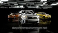
The company that created this commercial for Scion is Imaginary Forces. This company is based out of California and New York with their main offices in California. Imaginary Forces did the commercial for Google Chrome and they used a lot of futuristic imagery for it. The Scion commercial is very similar in that regard but has some differences just like all commercials do.

This commercial has a lot of similarities to the Google Chrome one but different. This story for this commercial is to get people to buy the new Scion. And the way that it is being portrayed is if one buys this car then that person will be an original and not be a follower. The car has the power to make someone into someone special if that person buys one.

In this animation text is used to get the point across to the audience. The text is 3D with a lot of depth. This depth is created with a shin coming left to right, which creates a shadow on the right side. This helps the audience see that the test is important to read. The reason why it is important is because it is telling the audience that these cars are original and that they should be bought. The text also goes along with the music, which has a beat to it. The text comes in through the ground and then dissolves through the ground; this gives the audience thinking that is cool and wondering if the car is like the text.

The audio for this is a background track, and a few sound effects that were added. The background track to this commercial seems like an electronic genre that has a heavy beat to it. This beat would seem to keep the audience involved in the commercial. The involvement would be to get the audience moving their heads to the beat. That little involvement is a big deal when it comes to getting the audience’s attention. The sound effects that were added to this commercial were car noises. This is when the car drove past the screen the sound of a car would go along with it. This makes the commercial more real to the audience in turn would show them what driving a Scion would be like.

Along with all of this there were two other important parts to this commercial that were added. They were the cars themselves and the flashing lights, which occurred on the ground or as a wall. The cars were 3D and had movement from one point to and another in which they moved. This gave them a sense of reality. Like the text the cars had a shin on them and create a shadow on the ground. This also makes them more realistic to the viewers. The small details that are added help out a product in the long run.

The flashing lights also help to bring in the audience. These lights change from white to green to orange to a mixture and to blue. The lights are there to transform the color of the cars. The lights are there to add another part to the commercial. This part that is added is a coolness that will pull in the audience and want to see what the commercial is about.

The entire commercial helps to bring the audience with the flashing lights and the music all together. Imaginary Forces has done a good job with this commercial.

Google Chrome

CHROME

Imaginary Forces: http://imaginaryforces.com/company

Google Chrome: http://imaginaryforces.com/featured/7/542


The company that did this commercial is Imaginary Forces who has two offices. One located in California and the other in New York. The company has done commercials, film, and broadcast. They have vast experience in the field of creating animations for different genres.

The theme for this commercial is futuristic since Google Chrome is a new way to use the Internet. This is done with an animation that looks futuristic. The icon goes through several different features that Chrome can do such as view pictures, Google maps, shopping online, to weather. All of this is shown in a 30 second commercial that is showing the audience that this new search platform is just as good Firefox, Safari or Internet Explorer but can still do everything that the originals can do.

The graphics in this animation are nice and futuristic by using metallic colors. Along with the metallic colors a shin and reflections are added to the main focal point. These additions help to bring the focal point to life. The background is white while the main focal point changes colors to show the audience what they are looking at.

The audio on this is to have an audience pretend to be watching this, which creates shocking reactions to the changes that go on. There is a small background track to the commercial. This makes sure that there is no dead air for the commercial. Along with these sounds there are sound effects that are added to help the audience follow the focal point and its movement. The audio track as a whole brings the creation to life. Without an audio track the focal point would be moving and the audience would not know what is going on.

The story for this commercial is to show the audience that there is a new what to look at the Internet and that is through Google Chrome, which is said at the end of the commercial. This commercial helps to show the audience that there is a new way and this new way is where the future will be.


Tuesday, February 16, 2010

New Balance Commercial

New Balance - Candy Collection


New balance Commercial
http://www.youtube.com/watch?v=_mgX0NYX48k

Syndrome
http://www.syndromestudio.com/

I chose this advertisement because it was by syndrome studio which did Rob’s Fantasy Factory opening. I think that this advertisement for New Balance brings the audience into a playful mind. The ad is eye catching with a variety of different colors along with sound effects to go along with the pinball atmosphere. The action throughout the ad is fast pace to show the audience that the shoe is up in coming and is the best product.

The advertisement is part of Candy Collection for New Balance and so they wanted to create an eye-popping campaign. The colors bring the candy idea to a reality. The colors bring the whole candy part alive. The main colors that are used are purples, pinks, blues and reds. These colors are what bring the candy part alive. Another thing that is used with the colors is light. When the ball hits a pillar the pillar lights up to show the audience what is happening..

Another big part of animation is sound which can range from sound effects, to musical track to a voice over. All of these are looked and this animation is no exception. The main audio track is an upbeat to keep the audience alive and awake. They don’t want to put people to sleep so this track is good to “show” what these shoes are like. The sound effects go along with the pinball theme. It is a ball bouncing off bumpers and going down holes. Then at the end there is a voice over. I thought this to be interesting because the some commercials have voice overs throughout the ad. But this ad decides to bring the audience in with visuals.

The visual effects that are used are 3D, which are most likely done in Maya or another program similar. These are created to show a fun atmosphere for the viewers. The effects also have shadows that show the audience depths to the objects that are moving.

The story for this ad is to show the audience to see something that is very visually nice. The visuals hook them into buying the shoes. While the main goal for this advertisement is to follow a ball through a maze and at the end there is a nice outcome. That outcome is a nice pair of shoes for everyone to like.


Fantasy Factory

Rob Dydrek's Fantasy Factory


Blogs 3 – Rob Dydrek’s Fantasy Factory
http://www.youtube.com/watch?v=xcwAnu_wRCE

Episode
http://www.mtv.com/videos/rob-dyrdeks-fantasy-factory-season-2-ep-4-local-celebrity-almost-dies/1621149/playlist.jhtml

Syndrome
http://www.syndromestudio.com/contact.html

I choose an opening to a television show to look at for my third blog. This opening is for Rob Dydrek’s Fantasy Factory, which is made by Syndrome Studio that is located in Los Angeles. Syndrome makes commercial, music video and stuff for broadcast television.

The opening for Rob Dydrek’s Fantasy Factor is unique and eye catching, which is what the television show tries to bring to the audience. This show is about crazy stunts that skateboarder Rob Dydrek does throughout his show. The opening gives that to the audience with the various stunts that Rob does from the beginning, to grinding on a rail to jumping into a foam pit. All of this can be see right at the beginning of the intro. The open tells a story that this show is going to be radical to the young demographic with all of its flashiness.

The animation that is done on a green screen then edited in post was done very well. The transitions from one shot to another of Rob are seamless. The transitions differ from following Rob or an object or a camera move is used. These three different transitions show the audience the wild and crazy things that might go on. The going from real people to cartoon to cartoon on a poster with Rob holding it was very well done. I thought this was cool because the movement from real life to fictional back to real life is something in openings that isn’t seen a lot. It is either animated or clips or people. Then when the walls collapse and it turns into his skate park is another interesting part.

The different animations are good but what makes them is the color pallet. The colors start out with cool colors and then turn to vibrant colors to get the audience aware of what might happen. This show is a very flashy with different stunts every episode and the colors show how flashy the show can be just through color.

Finally the music that is played in the background by Steel Panther brings everything together. The reason is that it is telling the audience that the show is fantasy but also at the same time real life. If one works hard then they can get their own fantasy.

Tuesday, February 2, 2010

Olympic Spirit

The animation that I looked at is located here:
http://www.youtube.com/watch?v=zyFzcwi0UsQ&feature=related

While the animator, Johnny Kelly, can be located at this location: http://www.nexusproductions.com/directors/johnny-kelly/

This animation is a very simple but it has a lot to offer even if it is very simple. The whole story is about everyone coming together through the Torch. The torch has a lot of different meanings for people and in this animation is seems to bring together unity of different people. The reason being that there is so much war and hatred going on but during the Olympics everything changes and people find national pride. Also it is showing that an Olympian has to go through a journey to get the gold and get applause. The story to an animation is a big part but there are other factors that go into an animation. These can be audio, visual effects and style that is used.

The audio for this animation plays really well into the story. The audio in this animation ranges from the music that is played to the sound effects. These added features help the animation come to life for the audience. The music is upbeat and keeps a constant rhythm. Ultimately it builds in strength, which shows that there is a main goal and that is a gold medal for the Olympians. As for the sound effects that were added they were the torch and how fire crackles, along with wind for the snow and a crowd cheering in the end. These three different sound effects along with the music have brought the audience closer to what the animator, Johnny Kelly, is trying to say. That an Olympians journey is a tough one but the goal is possible.

The visual effects for this animation are nothing flashy and seem to incorporate stop motion with other forms of animation. This helps to show a wide range of animation within 32 seconds. Visually this animation is something that can be looked at today and people might question why it is made because of all of the different advances in technology. This animation was made to show people that complex animations are not always the way to go. Sometimes a simple animation is better than a complex one.

In the end of the animation the world becomes a flag and then that flag turns into a gold metal for an Olympian. This is interesting because a spirit comes out of people during the Olympics and that is represented through the nations flags.

This is a good animation all around because it is simple and gets the audience to think about the Olympics. Also this animation shows that the Olympics can help bring people together. Johnny Kelly has done different kinds of animations but all stay with this pattern.

Monday, January 25, 2010

BBC's Winter Olympics Promo

This is the promo that airs on BBC
http://www.youtube.com/watch?v=9JAqz-Kn2KE

This is the firm that created the promo for BBC
http://www.studioaka.com/

This is a short promo for the Winter Olympics that is playing on BBC. This promo was done by Studios AKA, which is a London based firm.

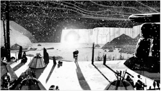
The story of this animation is a good one because it focuses on one character, Inuit, who spots a glow in the side of a mountain. The Inuit then ventures down the hill transitioning from sport to sport. The Inuit's main goal is to get to the end where the glow is which is the main focus. This represents the peak of all Olympic sports wich is a medal. Then in the end gives the audience a place and time of when the Olympics begin so that they can tune in and watch them.

The color of this animation is simple, it uses whites and blacks to tell this story with different shades. The different shades helps to represent the three-dimensional forms. If the aniamtion had color in it the entire animation would be completely different. The animation would have a different sense and maybe not be as dramatic as it is now, which would not draw as much people.

Another part of this animation that is good is the sound that is used. The sound that is used just begins with wind then transitions into dramatic music. Since this is the animation is for promoting the Olympics so the music will get people pumped up and wanting to watch them.

The effects that are used for this animation are interesting because it does focus on the one character and his journey from the top of the mountain to the bottom. The visual appeal to this is that the characters and the wolves are simple they are not complex and difficult to follow. The snow underneath the Inuit when he is snowboarding and skiing comes up which gives the sense of the Inuit actually being on snow. Then when the Inuit is lugging down the mountain there is movement on the ground and wind going on his face which gives the representation of going down the mountain fast.

I think that this animation is a good one because it holds the audience attention to see what will happen with the Inuit. Everything was simple with using just blacks and whites and all the shades in between but the uses of them were well done. Also the use of wind while being on top of the mountain gives the animation that it is real rather then being something that was made by an animator. Everything was thought out and everything that was made was made for a reason to represent the Olympics. This animation does that. It gives the audience a brief look at the Olympics through the Inuits movements. I enjoyed watching this animation and seeing how a firm would portray the Olympics.